- +91-99141-56467
- info@deovateworld.in

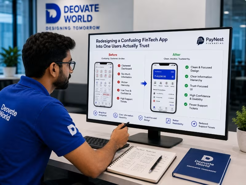
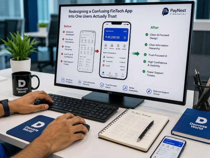
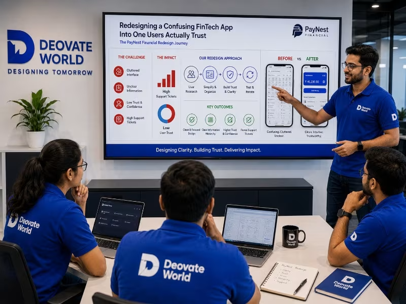
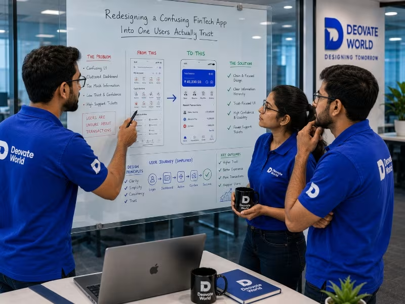
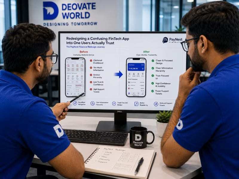
<p>PayNest Financial's app handled real money for its users but had a confusing, cluttered interface that was generating a steady stream of support tickets from users unsure whether transactions had actually completed successfully.</p>
<p>Key actions, sending money, checking balances, viewing transaction history, were buried across inconsistent navigation patterns. Critical confirmation states were visually unclear, leaving users uncertain and anxious about whether a transaction had genuinely gone through.</p>
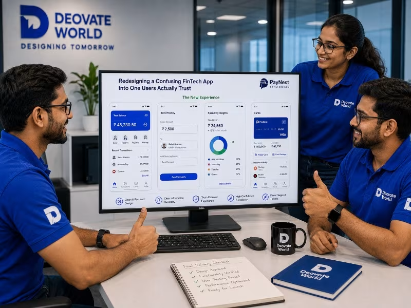
We redesigned the core user flows around clarity and confidence, particularly transaction confirmation states, which now use unambiguous visual and text confirmation at every critical step. Navigation was simplified around the handful of actions users actually performed most often, removing rarely used options from primary view.
Support tickets related to transaction confusion dropped sharply within the first month post-launch, and user session recordings showed noticeably less hesitation and backtracking during core money-movement flows.
"Our support team used to spend a huge share of their time just reassuring users that a payment had actually gone through. That entire category of ticket has nearly disappeared since the redesign." — Head of Product, PayNest Financial

Verdant Learning Co. had built a genuinely strong online learning product, but its visual...
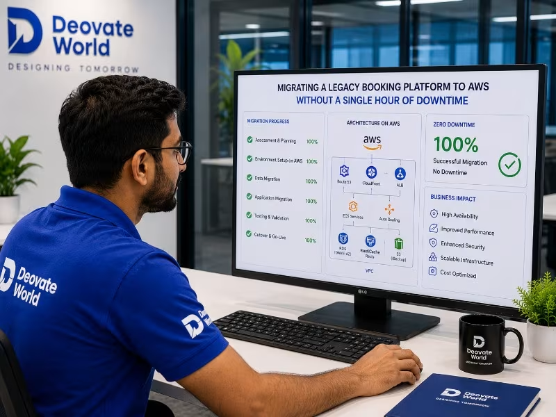
Skyline Travel Group's booking platform was running on aging, on-premise infrastructur...

Northbridge Software Solutions had a technically solid product but almost no organic searc...